

In this post, Pad Warrier, product manager at Zenoss, interviews Natalia Bakusevych and Carl Camera about the Zenoss design system. A beautiful user experience is the result of a purposeful, principled, and process-driven approach that begins with customer discovery. Natalia and Carl describe Zenoss' continual evolution with before and after examples that highlight increased productivity and efficiency for both Zenoss and our customers.
Pad: With me are two rock stars who continually strive to delight our customers with an awesome user experience. Natalia is a senior UX designer, and Carl is a senior software engineer and UI developer.
So, let’s start there. Carl, what’s the difference between UI and UX? And how does that relate to your role and to Natalia’s?
Carl: Hi Pad, thank you for inviting me. Of course, UI stands for user interface and UX stands for user experience. Let me explain with a little story. I took my family on vacation last year. We got our rental car, and the boys put the luggage in the back of this enormous trunk. Then, everyone is seated, buckled up, and ready to go. And my wife asks, “Why aren’t we moving?” I look back at her and reply, “I’ve got to figure this thing out.” I am looking at the dashboard, and my eyes are flooded with all this iconography. I am trying to figure things out, like where are the turn signals, windshield wipers, and gas gauge? The ability of the car manufacturer to get me from “figure this out” to putting a several-thousand-pound vehicle into drive and leaving the parking lot is the user experience. That’s the difference. What is shown to me is the user interface. How I interact with it is the user experience.
At Zenoss, we regularly try to imagine ourselves as users – looking at our UI for the first time with a wide-eyed feeling. We use lots of industry best practices and human psychology to guide users to feel comfortable and confident. For instance, if you are looking for user settings, you are probably going to look for it under your avatar. That’s a standard pattern.
I like to think of our roles complementing each other like an artist and animator. Natalia deals with color coordination, layouts, mock-ups, and workflow. She makes the UI meaningful and useful. I and others on the UI development team are tasked with bringing those static images to life. We need to make those static layouts work on several different browsers and devices.
Pad: That’s a great overview, Carl, and a great story as well. But let’s take a step back. The question that comes to my mind is, why bother? The primary use for our product is IT operations. Why can’t we just stick with the command line and bash scripts? Natalia, your thoughts?
Natalia: When Apple, inspired by the Xerox interface prototype, introduced the first public GUI on Mac, it was a major leap in progress. It was designed as a response to the problem of inefficient usability in early text-based command-line interfaces for the average user. This was the beginning of user-centric design, which empowered users and significantly improved efficiency. In Zenoss Cloud, visualizing data and empowering IT Ops specialists is our key priority. Therefore, making our product interface as clear and intuitive as possible is so important.
When you start building a product, you have a lot of things to consider during that process. But one crucial thing is always behind the scenes — UX and UI design. For product people, you all know the challenges and how it is important to create a seamless experience and beautiful look and feel.
But before you start creating experience and “eye candy” UI, you need to define the story. What are users doing? How are they doing that? And why are they doing that?
User experience is not only about the visual part of the system; this is only the tip of the iceberg. A significant part of the work is an investigation, interviews with stakeholders, users, and customers, and tons of processing documents. All of that is done with just one intention — to align business goals and user needs and create an experience that matters. We have completed an extensive discovery phase driven by design-thinking methodology. After gathering a ton of feedback and ideas from interviews, testing, and brainstorming sessions, we started thinking about how we could scale the system and optimize the delivery process. What are the ways of ensuring the consistency and enabling reusability of various components and elements?
And of course, the answer was a design system.
Pad: Yes, I remember participating in customer interviews and getting feedback on our mock-ups. That’s part of our design thinking. Can you share your thoughts about what life was like before we adopted a design system?
Natalia: Yeah. But, probably before I share some problems that we’ve faced, let’s clarify what is the design system we are all talking about here.
A design system is the single source of truth that groups all the elements that will allow the teams to design, realize, and develop a product: UI components, elements, visual language, guidelines, patterns and behavior, tone of voice, and many other parts. It also includes a shared component library among all the UI developers.
Our goal with the design system is to achieve shared understanding between all team members. To create the component, pattern, and behavioral ecosystem across the product. Which improves users' experiences, reduces cost and production time, and increases product scalability.
The Zenoss design system isn't only a collection of the assets and components you use to build a digital product. Most design systems are just pattern libraries — a big box of UI Lego pieces that can be assembled in near-infinite ways. Understanding the what and why behind the design of a system is critical to creating an exceptional user experience. Defining and adhering to standards is how we make that understanding concrete.
Now, let’s review some of the problems we faced:
- No consistency between styles.
- No guidelines for the behavior of a described component.
- No clear understanding of where to use an element/component.
- No accessibility support.
- No alignment across the application; therefore, a lot of elements looked “damaged.”
- No consistent experience with the product, i.e., similar features worked differently.
As a result, our design and engineering teams:
- Spent more time on design as there were no guidelines to follow and no component library to reuse, so developers needed to create each element from scratch.
- Spent more time validating rules, testing colors and elements, and correcting inconsistencies.
- And ultimately spent more time and money on design, implementation, and bug fixing instead of building new features.
Ultimately, the product was not scalable and would need rewriting if we needed to change technology, approach, styles, and so on. Not to speak of a disjointed user experience for our customers.
So, it all sounds not so great, right?
Pad: Yeah, it does highlight the problems we faced before we started this journey. And I am sure Carl will expand a little bit later on the challenges he faced on the development team. But these days, Ani, our CTO, talks about a “beautiful experience.” That’s a provocative word for an IT-focused product. What makes our product beautiful and why does it matter? And how did we change our focus?
Natalia: Beautiful UX is an experience that actually solves the problem. It helps users achieve their goals faster and makes the product more attractive. From psychological research, we know about the aesthetic-usability effect that refers to a user’s tendency to perceive attractive products as more usable. People tend to believe that things that look better will work better.
At Zenoss, we also derived and applied these key UX principles that helped us to build a better experience and achieve our initial goals:
- Consistency - According to this principle, systems are more usable and learnable when similar parts are expressed in similar ways. Also, users expect products to be consistent with similar products they've used in the past. Our design system introduces a shared set of principles and rules to build components. It makes it much easier to create consistent experiences across the platform.
- Usability - Usability measures how well, quickly, and easily users can use the product and achieve their goals. At Zenoss, we conducted the usability audit that helped us define and address the main pain points during the interaction with the system. Also, we regularly perform user testing to ensure that our product is intuitive, self-explainable, and easy to use. We increased the product's explainability, readability, and information density, which allows our users to work faster and more efficiently and focus on information that matters.
- Accessibility - Accessibility takes an important part in our investigation and testing. We have clients worldwide, and among those people are colorblind users and users with different types of disabilities. We care about all of them, so we need to make sure that our product is for everyone. That's why we've tested all our colors, fonts, components, and flows to be aligned with Web Content Accessibility Guidelines (WCAG).
- Efficiency - Instead of building similar components from scratch, ready design systems and a shared UI library allow the team to reuse components and increase efficiency. Also, it brings newcomers up to speed much more quickly, and building the product becomes faster.
- Scalability - Increased efficiency, usability, and consistency enable us to build faster products at scale. It's also related to responsiveness and how quickly and effectively we can implement new features without rewriting existing infrastructure. With the design system and UI component library, it's much easier to scale and build new functionality.
Pad: That’s great. Sounds like our customers and partners can also benefit from these principles in designing products for IT administrators. Can you touch on a few before and after examples?
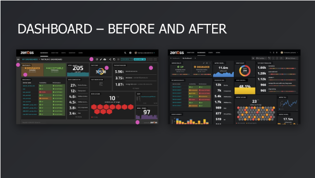
What has been done:
- Improved information density.
- Changed layout, color schema, typography, etc.
- Organized controls and buttons.
- Defined primary and secondary elements on the page and built the right hierarchy.
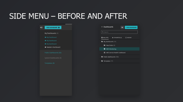
What has been done:
- Improved experience for the side menu.
- Fully redesigned styles.
- Added additional features that allow users to find and organize their dashboards.
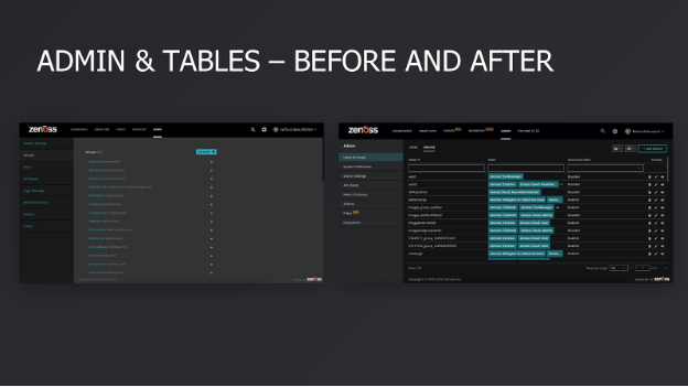
What has been done:
- Reconsidered and redesigned page structure.
- Unified components, making it consistent with similar features on the platform.
- Improved experience by using tables that makes it easier to interact with the feature.
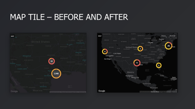
What has been done:
- Improved contrast.
- Improved map and color styles.
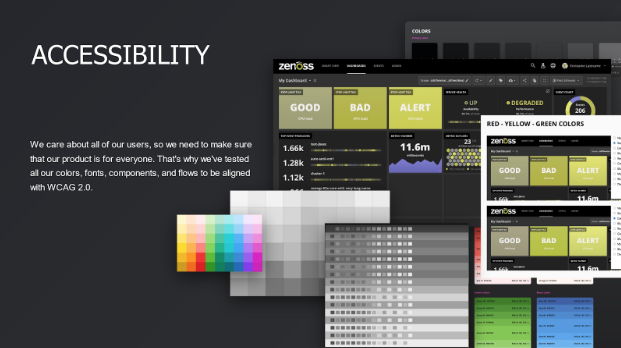
What has been done:
- Tested all colors to align with WCAG.
- Tested all typography.
- Tested layouts, components, and buttons.
- Tested contrast.
- Tested flows.
- Reduced noise and styles to make it easier to interact with the system.
- Redesigned the whole experience with the product to make it more accessible for everyone.
Pad: Carl, all this sounds wonderful — like getting on a diet and exercise plan. But how do you stay healthy? How do you make sure that you don’t have code bloat? Also, we don’t have huge resources like the software giants. So how do we make sure our user experience is of the highest quality?
Carl: Right, that’s the challenge for the UI engineering team. We need to create these reusable components. It’s natural for developers to constantly add new features by copying similar components and tweaking them to the specific needs of the feature requirements. This often leads to multiple unique components that look and behave very similarly. Then, when we need to enhance one of the components, we end up needing to update multiple components.
To combat this problem, UI developers meet regularly to identify opportunities to consolidate components and clean up code. For example, we used to have multiple donut visualizations and multiple metric charts, and we now have one of each. And now that we have one chart, we can more easily change our charting library.
Internally, we also use tools like Invision as a UI tool to help us communicate between the design and development teams — it provides some interactivity and workflow examples. And when there are questions, we communicate in various ways, e.g., via Slack, Zoom, phone, and, of course, using Jira.
Another thing we do is iteration reviews. We can’t do extensive A/B testing or have focus group testing like the software giants, but we do regularly preview soon-to-be-released UI changes internally. We schedule meetings where we demonstrate new UI features and interactions. Anyone in the company can attend in person or virtually since it is broadcast live. These review meetings help us to gather feedback from customer-facing teams and people who deal with the product every day. Almost everyone has an opinion on the UI! We always appreciate their feedback, and we have more than once altered our UI based on the feedback we received.
The next thing we do is feature flags. We can code in features and then enable them for specific audiences before releasing them to all our customers. This provides additional field testing to ensure everything is working well and allows us to very easily revert to previous functionality should a problem be found.
And we’re constantly deploying new features and fixes. “Upgrading” for our customers is seamless; it’s just a refresh of the browser. But, it does place additional responsibility on us to make sure that what we’re rolling out is of the highest quality.
Pad: Thanks, that’s a great description of a very detailed and disciplined process. We also introduced “Alpha” and “Beta” flags in the UI to help users know about upcoming features. And we’ve done UI mock-ups using the same Invision tool with our customers and prospects. In addition, we also have an early adopter program for key feature areas like anomaly detection and Microsoft Teams monitoring. We’ve gotten valuable feedback from our customers to help us to shape the direction of these feature areas.
Let’s wrap up with some benefits and some concrete examples you can give for our audience.
Natalia: Let’s review real numbers – what has been done and how it’s impacted us. Some key results include:
- 3x quicker task completion.
- 70% more team efficiency.
- 90% of all our components are reusable.
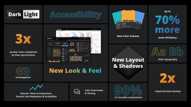
Pad: Wow, those are some impressive results. 90% reusable components — that’s huge. And we are just getting started.
Natalia: Yeah, and this is just the beginning. We create experiences that matter.
Pad: And on that note, thank you both.
Watch the entire interview to learn more: